Think about where a personalised name will sit
A name has to work on the object at its real size, not just in a large preview on a screen.
Look at the object from a normal distance
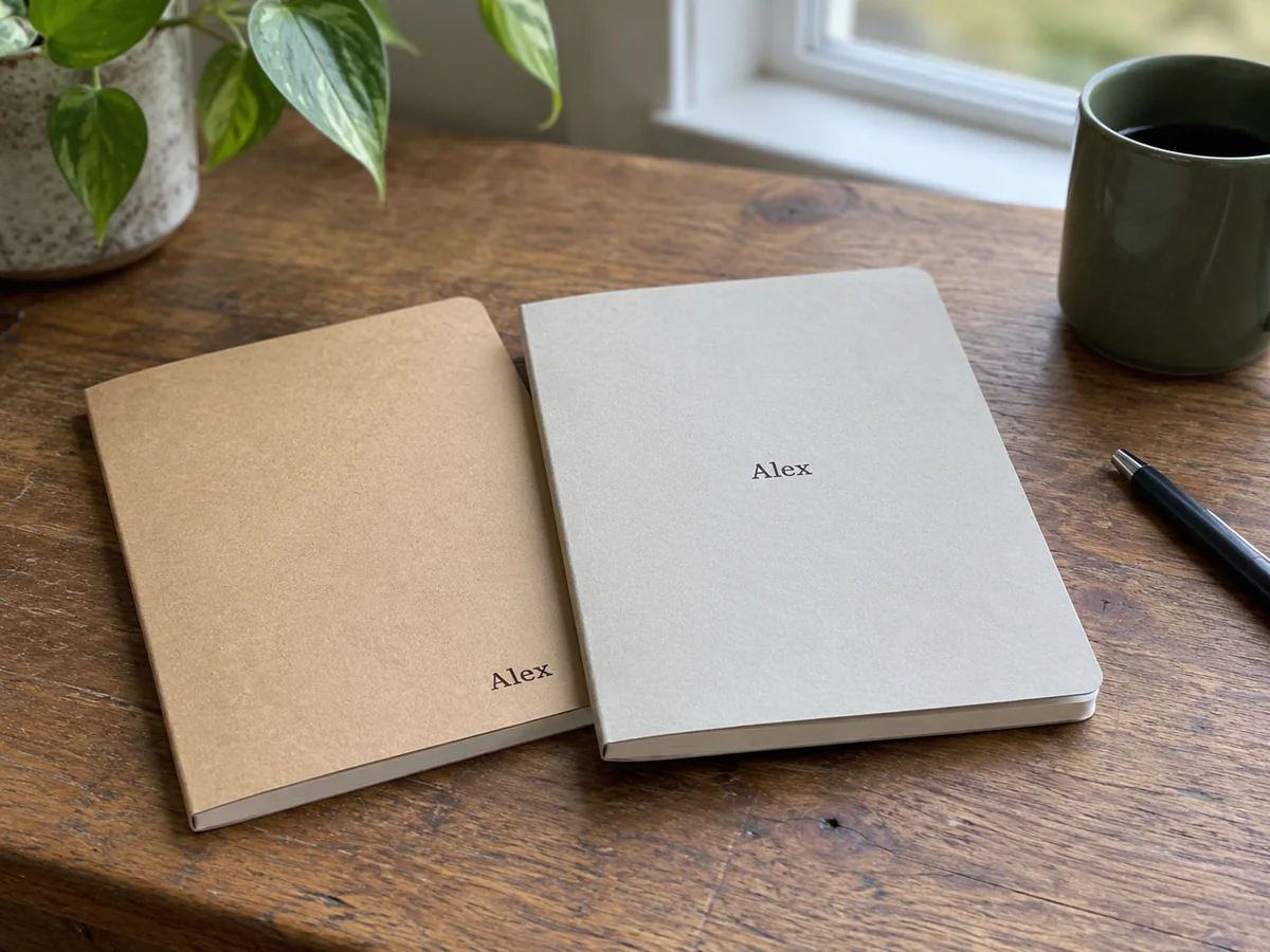
A personalised name can dominate a mug, sit quietly near a notebook's edge or become difficult to read across a folded pouch. Start with the scale of the finished object. Online previews are often shown much larger than life, making delicate lettering appear clearer and small spacing problems easier to overlook. Check the stated print or engraving area and imagine it in your hand.
A quick paper mock-up can help with scale. Write or print the text at the approximate size, cut out the area and place it on an object with similar dimensions. This is only a planning aid, not a production proof, but it can reveal that a long name is much more prominent than expected. The seller's final dimensions and technical limits still take precedence.
Names do not all occupy the same space
A design shown with a short name may change when given twelve letters. The maker might reduce the type size, move it to two lines or use a wider area. Read how longer text is handled before ordering. If you prefer a particular arrangement, ask whether it is possible rather than assuming the preview will automatically produce an equally balanced result.
Decorative typefaces need attention at small sizes. Fine strokes, tightly spaced letters and elaborate capitals can become less readable depending on the production method and surface. Embroidery, engraving and printing have different requirements, so advice for one cannot be applied blindly to another. Choose a style the maker supports for that material, especially when accents or unusual characters are involved.
Think about the way it is held
On a mug, the name may face the drinker or the room depending on which hand holds the handle. On a tote, a low inscription can disappear into a fold when the bag is carried. A notebook's lower corner may rub inside a sleeve. These are not reasons to avoid personalisation; they are reasons to consider the object's ordinary position rather than only its front-facing photograph.
Leave breathing room around existing graphics, seams and closures. A name squeezed against a zipper can look accidental, while several separate messages may compete for attention. If the gift already has a strong illustration, a small name or initials may be enough. There is no requirement to fill the entire available area simply because the order form permits more text.
Use a proof when offered and check layout alongside spelling, colour and the exact product variant. Confirm whether what you see is an illustrative mock-up or an approval for production. Keep requests clear and within the maker's capabilities. A personalised detail works best when it feels at home on the object, leaving the recipient with something comfortable to use rather than a miniature billboard of their own name.