The feel of a print on fabric
A graphic can feel almost integrated with the cloth or sit as a distinct surface. Decide which sensation you prefer.
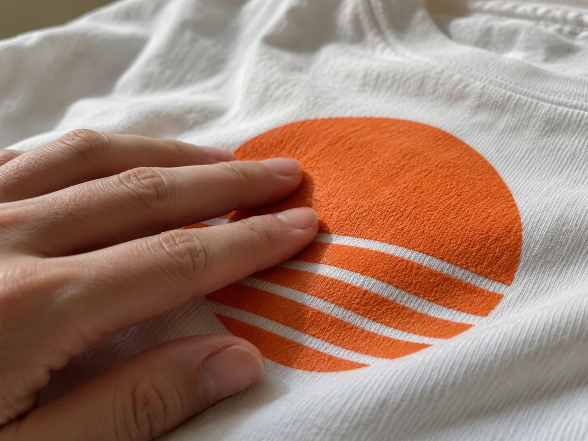
Touch the artwork as well as the cloth
A product description may emphasise a soft shirt while saying little about the graphic covering its front. The printed area can have a noticeably different feel from the surrounding fabric. If possible, run a fingertip gently across the edge and then over the centre. Decide whether that difference is comfortable for the way you will wear the garment.
Printers sometimes call this the hand of the print. It reflects the complete combination of technique, materials, artwork and fabric. Do not assume that every example of one printing method will feel identical, or that touch alone reliably identifies the process used.
Area and coverage change the experience
A small mark on the chest is a different proposition from a large, solid block across the torso. Even when the print surface feels acceptable in a small patch, you may notice it more over a broad area. Open designs with spaces between elements can also feel different from uninterrupted coverage. Look at the actual artwork rather than judging only the method name.
Try the shirt through ordinary movement. The fabric may fold easily around a print, or the printed section may create a more pronounced panel. If the garment will be worn beneath a close layer, inspect how the surfaces interact. A texture that is enjoyable on its own might catch or rub against the inside of another garment.
Opacity and softness can pull the production decision in different directions. Printing a bright design onto dark fabric may involve materials or layers that are not needed in the same way on a pale shirt. Ask for information about the finished colour combination rather than assuming a sample on white predicts the result on black.
Read the instructions before deciding it is wrong
Some fresh prints can have a temporary smell or surface appearance associated with production. Follow the maker's explanation and care instructions rather than experimenting with a solvent or aggressive scrub. If the image is sticky, lifting or visibly damaged, contact the seller before washing it and potentially changing the evidence.
For a remote purchase, request a close-up and a plain description of the printing technique. Words such as premium or vibrant mainly describe a sales promise, not the sensation against the body. A real sample is useful for a larger order, but a single shopper can still ask specific questions about coverage and care.
Choose according to your preference for the complete garment. A distinct raised print is not automatically inferior to a softer one; it may be part of the design. The important point is that the image looks and feels the way you expected, with a care routine that preserves both the artwork and the fabric beneath it.
Further information