Matte and gloss stickers in everyday light
Gloss catches light; matte changes the reflection. Compare how the design will look where you actually use it.
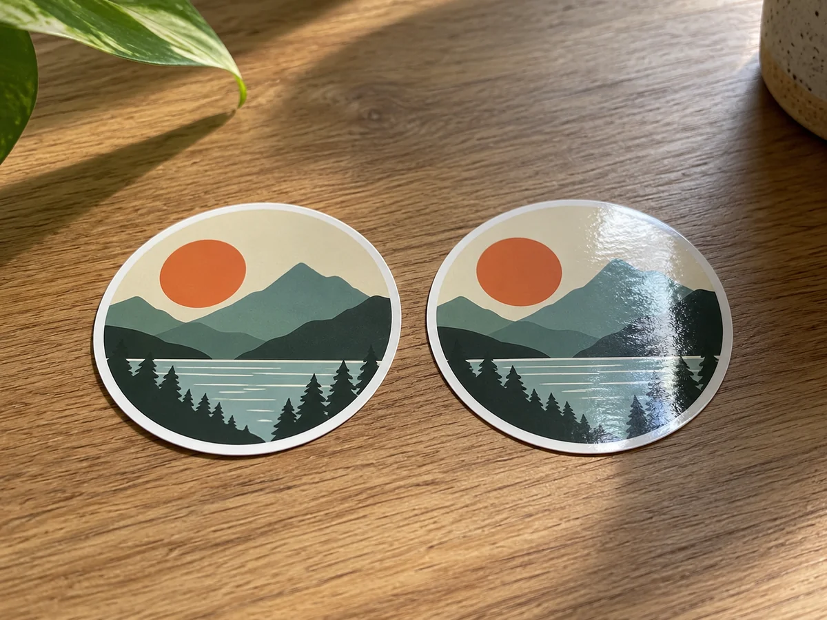
Look under ordinary room light
A glossy sticker can make a colour feel lively, while a matte finish can look softer and less reflective. These are visual tendencies, not a reliable ranking of quality. The underlying print, coating and artwork still matter. A glossy dark design may show a bright window reflection, whereas a matte version might be easier to read at the same angle. Turn a sample under normal light instead of judging only a front-facing product photograph.
Consider the design itself. A small line drawing, a block of type and a detailed photograph ask different things of a surface. With tiny lettering, contrast and print sharpness may matter more than whether the finish shines. If the sticker will sit on a curved object, reflected light can move across it as the object turns. A finish that looks excellent on a flat backing sheet may behave differently on a bottle.
Finish is not the same as material
Matte does not mean paper, and gloss does not mean vinyl. Makers can offer different finishes on the same face material, or similar-looking finishes on different constructions. Read those parts of the listing separately. Water resistance, removability and outdoor suitability should be stated rather than guessed from the amount of reflection. A subdued sticker is not automatically delicate, and a shiny one is not automatically weatherproof.
Writing on the surface introduces another question. Some finishes accept certain markers well; others let ink smear or wipe away. If a handwritten name or date is part of the plan, check the maker's guidance for that exact stock and pen type. Test on a spare, allow the recommended drying time and avoid pressing on the fresh ink. A finish chosen for appearance may not be the best writing surface.
Match the surroundings without overthinking them
On a matte notebook cover, a glossy sticker creates a noticeable contrast. On a polished case, a matte design can stand out quietly. Either can be appealing, but leave enough space around the design for it to read clearly. Several reflective stickers crowded together may look busy under a desk lamp even when each one is attractive by itself.
For an important purchase, a small sample is more informative than increasingly close screenshots. Screen brightness and photography can exaggerate or suppress the shine. Compare the sample at the distance you will normally see it, then check the product's separate care and adhesive information. There is no need to make every object match perfectly. The useful finish is simply the one that lets the design look the way you want in the light and setting where it will live.
Further information